
Most personal finance tools are designed around a flawed assumption:
If users are given enough data, they will make better financial decisions.
Modern finance apps require users to continuously manage:
• Constant balances, charts & categories
→ always-on financial awareness
• Multiple competing recommendations
→ conflicting guidance
• Manual rules, alerts, and thresholds
→ configuration responsibility
• Long-term goals — short-term trade-offs
→ unresolved tension
Instead of enabling clarity, these systems increase cognitive load and shift responsibility entirely onto the user.

A typical finance UX failure loop:
choice overload → emotional pressure → avoidance → abandonment
Through secondary research and competitive analysis, a consistent pattern emerged:
Finance products tend to optimize for:
While users actually need:
→
Fewer, better-timed decisions
→
Clear boundaries instead of constant choice
→
Guidance that reduces mental effort, not adds to it
This misalignment leads users to disengage — not because they don’t care about money,
but because the system demands too much cognitive work.
Building a finance app
→
Designing a decision-support system
This insight set the foundation for Finnovó:

Only after redefining the problem this way did interface design become meaningful
"More data leads to better decisions"
More data increases interpretation cost, not clarity.
📌
Decision paralysis
“Users want full control at all times”
Users want guardrails, not micromanagement.
What users actually prefer:
📌
Control fatigue
“Automation is either trusted or rejected”
Trust is conditional and progressive.
Users trust automation when they understand:
📌
Blind automation → distrust

ASSUMPTION → REALITY → FAILURE MODE
Blind automation reduces trust.
Transparent, reversible automation builds it.
Constraint:
Design consequence:


Constraint:
Design consequence:
Constraint:
Design consequence:


Constraint:
Design consequence:
Defining constraints was equally important.
• Manual categorization
• Competing recommendations
• Constant budget micromanagement
• Assumed financial literacy
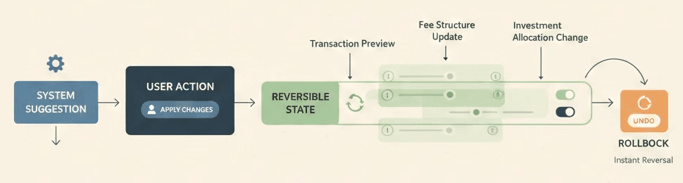
AI never executes financial actions without user confirmation
→ Preserved trust & user agency
No raw data walls by default — only decision-ready summaries
→ Reduced cognitive load
Contextual, non-judgmental nudges only
→ Higher emotional safety & re-engagement
System stays quiet unless intervention is meaningful
→ Quiet reliability over attention capture
In most finance apps, automation operates invisibly — recommendations appear without clear triggers, assumptions, or failure handling.
Finnovó treats AI not as a prediction engine, but as a decision mediator operating within strict system constraints.
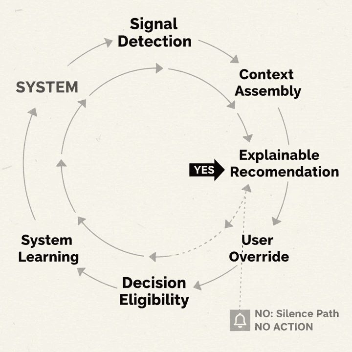
A Constrained, Interpretable Decision Cycle
Every system action in Finnovó passes through the same loop.
The system cannot suggest, intervene, or alert unless all stages are satisfied.
Behavior
Signal
Suggestion
User Control
Feedback
Signal Detection
Spending drift, Boundary proximity, Pattern deviation
Context Assembly
Decision Eligibility Check
If no → system stays silent.
If yes → continue.

Why This Loop Matters
The system earns trust through predictability, not persuasion.
Intervention vs Silence
System Behavior:
→ Prevents regret without blocking intent


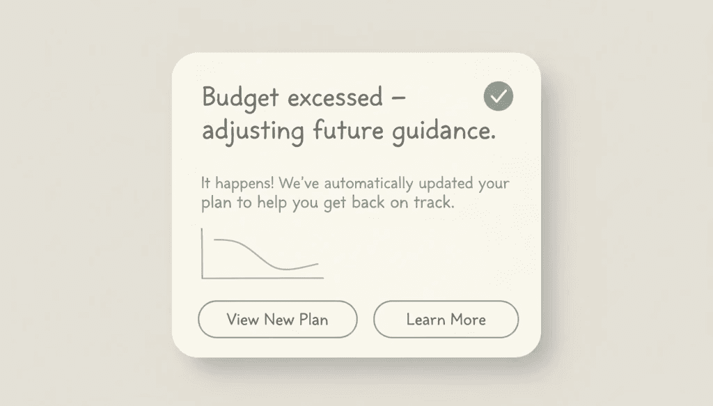
User exceeds a budget boundary.
System Behavior:
→ Reduces shame and encourages recovery
Repeated small deviations across time.
System Behavior:
→ Shifts focus from events to habits

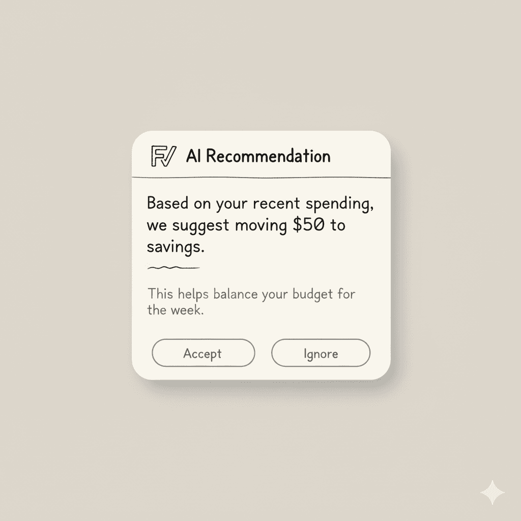
System Behavior:

Intervene only when the system can reduce cognitive load —
stay silent when intervention adds none.
Failure was not treated as an exception.
It was assumed, expected, and designed for.
(no uninstall, no opt-out)
→ Quiet reliability

Primary Failure: Budget Breach (Overspending)
Overspending is the most common and most emotionally charged failure.
System response
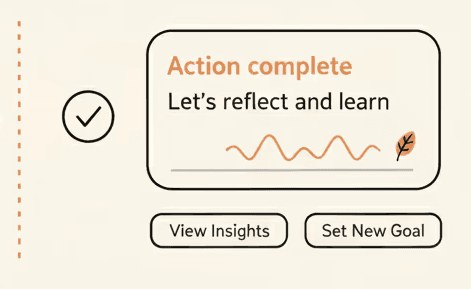
The system waits until after the decision, then reframes it.
Why
Failure is absorbed — not punished.

Secondary Failures: When Users Disagree or Disengage

These are not treated as errors. They are treated as signals.
The system listens more than it corrects.
Recovery Over Prevention
Finnovó optimizes for:
Users are never forced back “on track.” They are invited to understand their own patterns.

Trust is not built by being right.
It is built by being predictable when things go wrong.
Finnovó remains consistent — even when users don’t.
Failure is the primary use case.
If the system works when users fail, it will work when they succeed.

Why This Matters

This approach reduces:
Outcome
Finnovó becomes:
• A system users return to after mistakes
• Not a system they avoid because of them
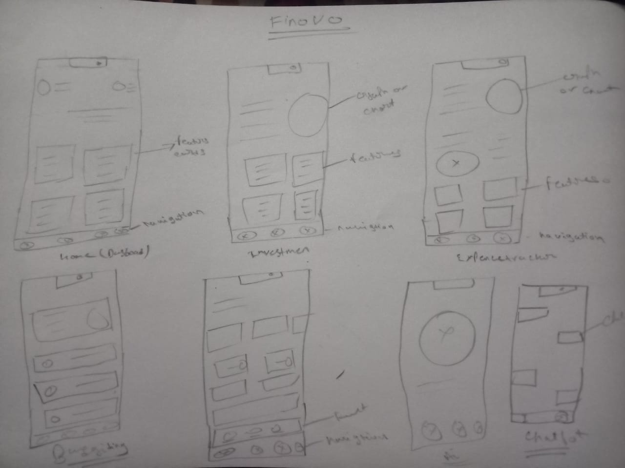
Early sketches focused on placement of decision moments, not visual style.


Each surface exists to support a specific cognitive state — not a task list.
user flows
Each flow was designed to end cleanly — without looping the user back into the system.


Pen-and-paper sketches
Early sketches focused on placement of decision moments, not visual style.
Low-fi greyscale wireframes
Visual hierarchy was tested before color, motion, or branding.
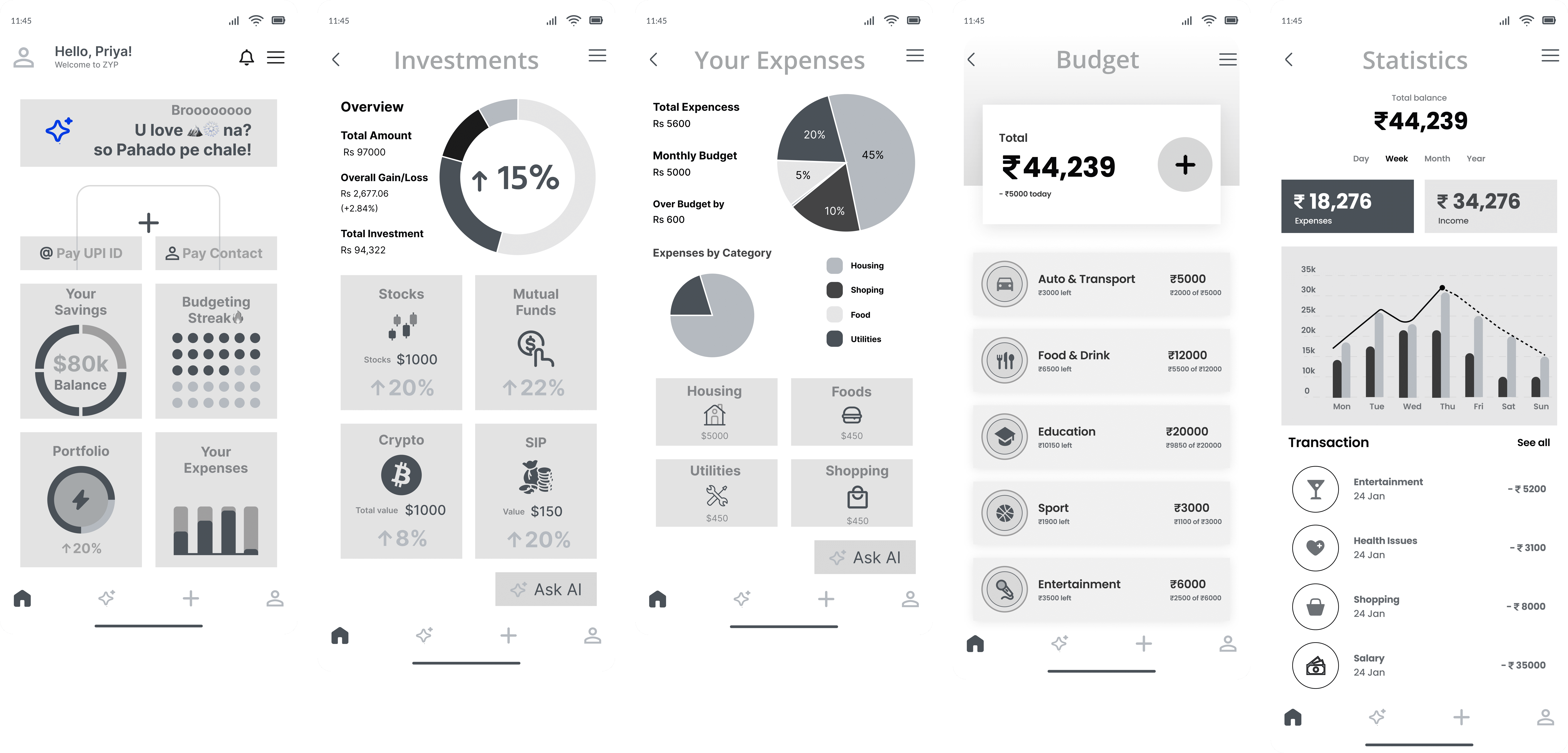
Visual quietness was a functional decision, not an aesthetic one.
High-contrast interfaces create urgency.
Urgency increases decision pressure.

The interface intentionally:
Even in dark mode, contrast was restrained to prevent visual dominance from becoming emotional pressure.
*Dark mode shown for consistency; system supports light surfaces in production
The interface was treated as a consequence of system behavior — not a surface for features.
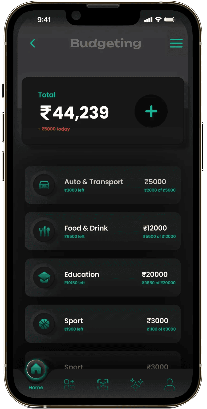

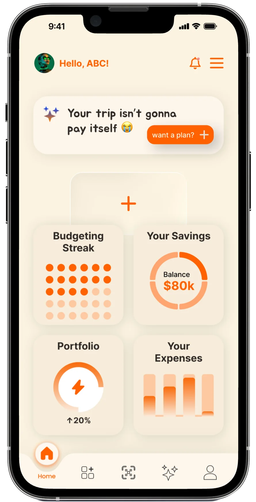
Home — Decision Awareness, Not Control
The home screen exists to prepare decisions — not demand them.
System context
• Detects behavioral drift
• Tracks proximity to boundaries
• Knows timing sensitivity
Intentionally hidden
• Transaction noise
• Predictive certainty
• “You should” language
Interface response
• Calm summary, no urgency
• Optional, dismissible nudge
• No raw data surfaces by default
Budget — Boundaries Over Goals
Budgeting was treated as boundary-setting, not self-discipline training.
System context
• Knows safe, risky, and forbidden ranges
• Detects slow drift, not single mistakes
Intentionally hidden
• Perfection metrics
• Optimization prompts
• Gamified streak pressure
Interface response
• Range-based budgets instead of targets
• Sliders emphasize reversibility
• No red states, no “failure” screens

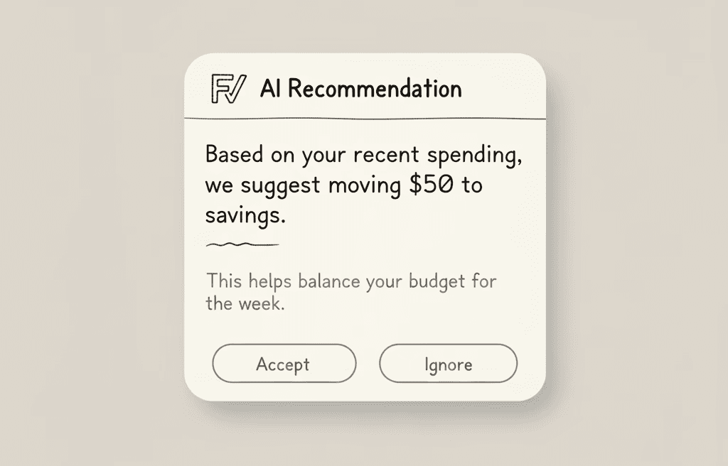
AI Recommendation — Advisory, Not Authority
Budgeting was treated as boundary-setting, not self-discipline training.
System context
• Confidence-weighted signals
• Known uncertainty
Intentionally hidden
• Confidence theatrics
• Corrective language
• Escalation paths
Interface response
• Accept / Ignore / Adjust always visible
• Explanation available, not forced
• Overrides have no penalty
The system never escalates disagreement into friction.
Protection without intimidation
Financial security shouldn’t interrupt flow or amplify anxiety. Finnovo’s security system is designed to protect users quietly, predictably, and only when risk meaningfully increases.
Progressive security
Friction proportional to risk
Clarity over alarm


DECISION PRESSURE REDUCTION LOOP
Observed shifts in user behavior:
What mattered:
The system reduced decision pressure, not financial mistakes.
What changed in the system itself:
The system learned restraint before it learned optimization.
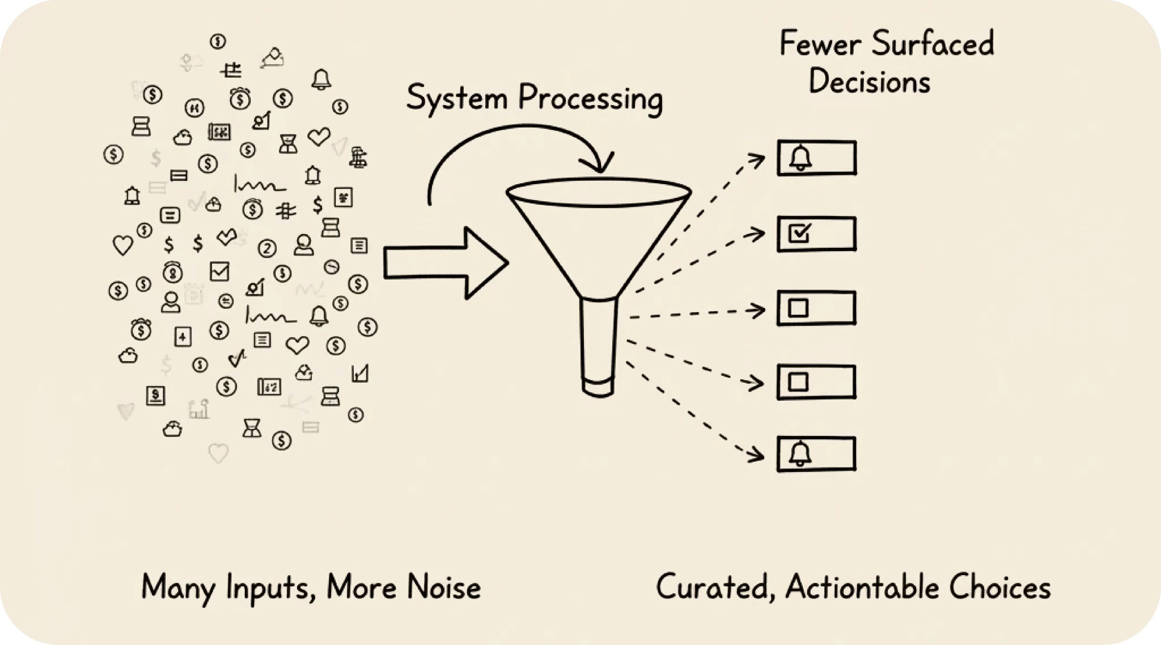
MORE SIGNALS → FEWER SURFACED DECISIONS → HIGHER TRUST
As an exploratory system design, Finnovó operated under real constraints:
• No access to real banking APIs
• No historical user trust or training data
• AI outputs could be uncertain or wrong
These constraints defined the system. The interface is a consequence of them.
What This System Was Not Validated On
This was an exploratory system — not a live fintech product.
• No real banking APIs
• No long-term user data
• No financial outcome claims
These aspects were validated through design reasoning, simulated flows, and behavioral modeling:
What Could Be Validated Pre-Production
System Predictability
→ Goal: Make system stress states transparent & understandable.
Emotional Safety Under Failure
→ Goal: Prevent avoidance, shame-driven churn, or disengagement
Override & Disagreement Handling
→ Goal: Trust through reversibility, not compliance
Decision Pressure Reduction
→ Goal: Reduce cognitive load without reducing agency
The system remains stable when users aren’t.
If deployed with real users, validation would focus on:
These cannot be responsibly simulated
Finnovó would be considered successful if:
The system succeeds if users stay — even when it’s wrong.
Why This Validation Approach Matters
Most fintech products validate control. Finnovó was designed to validate resilience — separating what can be reasoned about safely from what must be earned through time and trust.
This avoids over-claiming intelligence and instead earns credibility through restraint.
Primary Success Signals
Reduced Decision Friction
Fewer moments where users hesitate or abandon budgeting actions
→ Signals cognitive safety, not faster decision-making
Budget Boundary Adherence
Spending remains within suggested ranges over time, allowing natural deviations without triggering punitive feedback.
→ Healthy behavior, not discipline theater
Healthy override rate (not zero)
Users occasionally reject system suggestions while maintaining long-term engagement.
→ Trust without obedience
Recovery Speed After Failure
Time taken for users to re-engage after overspending or boundary breaches.
→ Emotional safety indicator
These signals were chosen over traditional ‘performance’ metrics.
Finnovó is not about budgeting.
Good UX is less about adding features — and more about deciding what not to surface, when, and why
Key Design Learnings
What I Would Improve With Real Users
This project will evolve beyond a 2D interface into a system that explores how motion, spatial computing, and AI can make financial information feel less intimidating and more humane.
Iteration 01
Initial Assumption
Financial information should be immediately visible for convenience.
Challenge
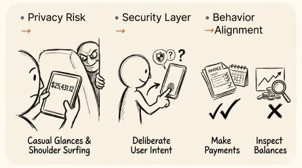
Sensitive financial data should require intentional access. Friction can act as both a security and privacy layer.
Design Decision
Balance information was removed from the home screen and placed behind a deliberate access point.
→ Sensitive balances could be exposed through casual glances or shoulder surfing.
→ Financial information should require deliberate user intent.
→ Users open finance apps more frequently to make payments than to inspect balances.
A typical finance UX failure loop:
choice overload → emotional pressure → avoidance → abandonment
Resulting Home Screen Philosophy
Instead of:
Home = Information
Finnovó evolved toward:
Home = Action
The primary surface now prioritizes frequent user actions such as QR-based payments, while sensitive financial information remains accessible through intentional navigation.
Before
Immediate
Convenience
Monitoring
→
→
→
After
Protection
Action
Intentional
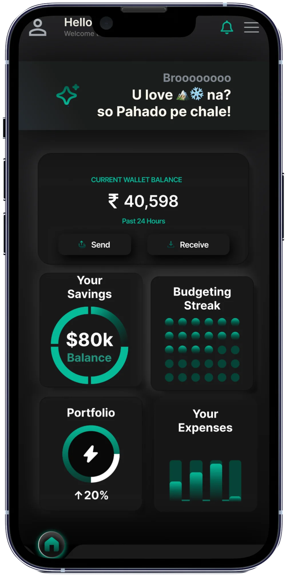
Immediate balance visibility

Intentional access + action-first home
Impact of the Change
• Reduced unintended exposure of financial data
• Required intentional access to sensitive information
• Better aligned with established fintech security practices
• Shifted the home screen from monitoring to action-taking
should sensitive financial information be immediately visible?
The feedback highlighted that, in fintech, a small amount of friction is intentional—it protects user privacy, reinforces security & ensures sensitive information is accessed deliberately rather than incidentally.
Aligning the Interface with Context
Months after the initial concept, I revisited Finnovó’s visual language while reviewing contemporary banking and finance products.
One consistent pattern emerged: financial interfaces adapt their visual tone to the user’s environment, using appearance not only for aesthetics, but also for comfort, readability, and long-term usability.
This prompted a redesign of Finnovó’s color system.
Immediate balance visibility
Intentional access + action-first home
What Changed?
Before
→
→
→
→
After
ッ

Design isn't about Aesthetics, it's about Storytelling, evoking emotions and driving actions